Below are my current links to my online presence, I have not as of yet got a live website, however I have purchased the domain name, and I am in the process of constructing and coding my website. but this will probably continue once the course has finished.
Behance - https://www.behance.net/mikeyscottjr
Website - mikeyscottjrdesign.com
Linkedin
Twitter - @Mikeyscottjr
Sunday 18 May 2014
Thursday 1 May 2014
Personal Branding // Website visuals and mock ups
As you click through the menu options you will find the choices
- Home
- About
- Work
- Contact
I do not want to over complicate this website, I want to use it purely as a promotional digital cv, and I don't want the complexity of the web design to take away from presenting my work.
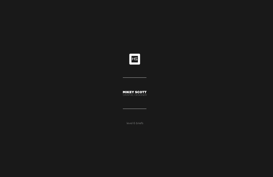
The website will be based around my visual branding that you saw earlier applied to my business cards, but in this context the logo doubles up as a platform for the menu bar to located.
The home page is simply my logo with a 'click me' button at the button, from them the logo and menu bar re locate from the centre to the top left hand corner and full screen images of selected portfolio product shots will randomly fill the screen as a background.
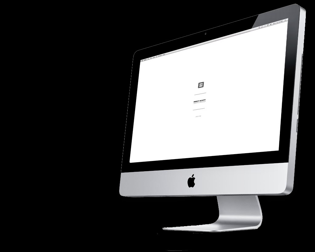
Starting page

Home
The background of the page will keep on scrolling through full screen images of my work but depending on the page that you have selected a different paragraph of information will be provided at the bottom left of the page as you can see below, this way, the viewer still continues to whitness my work but also can read the information they require.

The same concept applies to the about page, but with further information provided about me as a designer and my specialist areas and bio.

The work page gives the viewer an option to select which specific works they would like to view, and once selected an archive of each project will be presented and they would then be allowed to scroll through and select images at will.

Contact information is a very simple page, with just my current information being promoted, I find with many designers websites, it is actually quite difficult to find contact information because it is often over shadowed by the physical design of the website. My intentions are to keep it as simple, understandable and aesthetically pleasing as possible.

Below you can see how each page is intended to be viewed on a computer screen, I need to update the layout to allow it to be applied to smart phones and tablets.
Start
About


Home

Work

Friday 25 April 2014
Personal branding // Updated business card mock up
At this moment I intend to send my business cards off to get printed professionally as I do not have time to hand print my stationary like I would wish. However at this current stage I just wanted to create a visual that would give some understanding of what they would be presented like, therefore I have mocked up the image below.

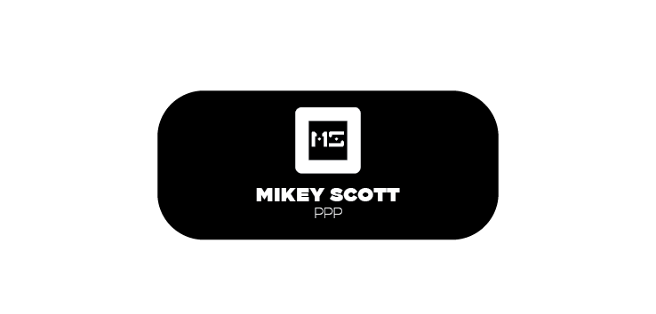
Personal Branding // Updated Business Card
For my personal brandng, I was actually quite happy with the visual side of my actual logo, but I think they way I have applied it to some of my stationary diesign does not could be updated to fit a style that I think suits me as a designer.
Below is the business card design I produced in level 5.

Therefore I have tried to apply this simplistic version of my branding to various other pieces of stationary I intend to include in my brand pack.
Below you can see my new business card option which I am much happier with.
The new design creates quite a modernist feel, but I want the visual element of my identity do remain both simple and consistent throughout my entire brand and I believe that this layout would allow the main core to remain the same throughout while using the thin text at the bottom to update information depending on what format the logo is applied to.
Front Variation 1

Front Variation 2 (chosen)

Back

Saturday 8 March 2014
PPP3 // Sagmeister Ted Talk
I have always considered Stefan Sagmeister to be one of my favourite designers, not just because of his unique and original design style, but also because of his positive outlook on life and design, He strives to enjoy all the aspects of his life, and uses his own happiness as a tool for his design. I often get worried that I will end up in an area of design that I will not enjoy, but i try to take inspiration from Sagmeister's positive outlook.
He also is one designer that I think promotes the message of being individual with your design, in a sense that I personally feel that alot of design follows trends, once someone comes up with something original and people like it, then often other designers will adopt that style of design for as long as that trend lasts, however Sagmeister's work is always original and he consistently finds new and interesting ways to produce a piece of design. This all comes from using his own ideas and using experiences and memories as a tool to produce original and interesting design.
Here is a Ted talk I found where Sagmeister explains his view on happiness in relation to design.
Saturday 15 February 2014
PPP3 // Mikey Says Manifesto
My Manifesto presentation trying to create a list of points I personally think can help you in life, I'm sure these points will be refined and changed over the years but at the moment I am content with this manifesto, especially point 7!
Subscribe to:
Posts (Atom)