Monday 12 December 2011

Design Process - 'How to...' Self Evaluation

What problem did you identify?
Due to the close relations of my groups previous How to's (excluding mine) we discovered they all related very well, as one of the how to's was 'How to travel crease free' we associated this with business travel, this evolved into the problem 'How to travel as a businessman'

What evidence did you find to support your decisions?
 After realising the close relation of the previous how to's this gave us a starting point to say that these are all problems that would be met by a travelling business man, and due to previous research this gave us a good starting point to base our concept on. we developed this further by continuing to research problems that a businessman may incur, this was mostly by quantitative and qualitative research collected from web articles.  

What methods did you use to gather your evidence and what forms did it take? 
 I had difficulty trying to develop some useful trust worthy primary research on this topic, as it was not just as simple as handing out a quick questionnaire to the rest of the class and averaging the results out, this is an area I really need to work on I think, I generally have collected most of my research from websites, web articles, existing info graphics, existing travel guides, as well as research into book / Pocket folds which I collected mainly from library books and online tutorials.

Secondary - I would say all the research I did was Secondary, I know this is not ideal but I feel it is important for me to develop my primary research collecting skills, i could have emailed businessmen, businesses that are renowned for travelling to see what they would find useful in a traveling business guide.

Quantitive - 
  • Business card dimensions around the world
  • Etiquette of giving / receiving a business card in china or America
  • Statistics of a typical business traveler
  • Passport dimensions around the world.

Qualitative -

  • Existing inf graphs
  • Existing business booklets/ articles
  • information and opinions of what a businessman needs.
  • Existing paper folds 
  • Reciept logs/ organisers
  • Existing Diary and calenders
What methods of research did you find useful and why?
The most useful research I found was the information on business cards internationally and the etiquette of giving/ receiving said card, this wasn't just useful for the brief but I found it strangely interesting that such a small in some way insignificant thing can be interpreted in completely different ways, and to be polite in one country may mean you are offending another. This proves that research is key to good design as someones opinion or assumption could possibly cause offense which in turn renders the piece of design worse than useless.
Also as a group not just individually we all found that finding an existing business handbook filled with numerous business based info graphs really gave us an insight into what is expected or what existing styles have been used to aid business people. 

How did these inform your response to your problem?
Taking inspiration from the existing business handbook was key to our final design looking as it does, we were inspired by the smart/neat/ straight edged approach that was taken when designing that handbook and we could relate with the design, helping us to create a similar aesthetic. 
The business card research helped me understand the differences between all 3 cultures which in turn allowed me to confidently and accurately design a page that would contain useful information that may have been found useful.


What methods did you encounter as problematic? 
In general I think every group had difficulties with contrasts of design ideas and problems with remaining in contact over the brief so that everyone is on the same page, concept wise.
I don't think we were any different, we did keep in contact by email and met up whenever possible (breaks and after college) but I think we still encountered problems as some peoples ideas were developing in different directions to others so therefore trying to organise the group so everybody knew what they were aiming towards as well as what their individual tasks were to help aid the final product was very difficult.

How did you overcome this?  
By keeping in contact and arranging regular meetings we managed to keep the design  moving forward, some tempers flared at some points but I think it was important to make sure at least once a day we all sat down together and caught up on everyone's progress, therefore everybody could put input into every idea which I think helped us end up with a design that we were all proud of.


What research could you have carried out that would have proved more useful?
As I said previously, I should have done more primary research as well as probably more quantitative research, I think doing more of both of these would have helped me and helped improve the quality of data that I collected, but as tasks were assigned it seemed easier and more time efficient to focus more on secondary qualitative research.

List five things that you have learnt about the design process over the last two weeks.
  • Research is key to good design
  • When working as a group ensure a good level of communication is maintained
  • It is important to take influence from group members as well as give influence to them.
  • Work more on presentation content 
  • Making mistakes in a design is important as long as they can be resolved for the better.
 List 5 things you would do differently next time.
  • Work out self set deadlines at the start of the brief.
  • Ensure every member of the team knows what tasks they have been assigned.
  • Make sure everybody in the group understands the design concept.
  • Allow more time for design.
  • Make sure I take advantage of primary research. 
I recently found out that certain members of the group were really not happy with anything that the group decided or produced, i understand that time management and organisation of the group could have been focused on more over the 2 weeks. However I feel sacrafices need to be made in certain situations when you find that you're group do not all get on 100% and some people feel their idea's are better than everybody else's. 
I understand the problems that they faced with the group but I think the rest of the group got on well and individually did their part. 
It was difficult to please some people and while time ran out, concept idea's became more and more complicated and in a lot of cases this would have involved dis regarding a week's worth of previous research and development. 
I am disappointed that everyone was not happy in the group as I think it is important to have a good working relationship when collaborating but then obviously not everybody will get on.

Monday 28 November 2011

Canoe and Kayak Logo

Through researching for my How To.... task i came across the Canoe & Kayak website 


I quite like the boldness of the logo and the typography used to creat it even though it doesnt seem to have a direct relation to canoe and Kayaking I think it is a visually pleasing logo

Monday 31 October 2011

3 designs I thought worth taking a picture of

 I thought the interesting use with colour and contrast 
was quite nice on this flier as well as the nice brightness 
of the print, not a huge fan of the type but the layout 
works well I think.

 I found this in "Casino" in Guilford, againg quite a simple 
design but I really like the colour simplicity, Red, Black and 
white such a fantastic comination, all complimenting with 
each other.
I also like the type, it works well with the layout of the
poster, but there was just an interesting feel to it with the 
illuminated back in a dark corridor.
blackvanilla in Black Heath this logo/ type is awesome, I love the simplicity and the hand drawn script type, I assume the idea of the long thin ascenders were to represent vanilla pods contrasted by the other letters designed with a small x height.
All this plus the simplicity of the black and white contrast, I think it's a very attractive shopfront.

Group task, Leeds Music and Venue Promotion.


Taken from a gig booklet for  "Nation of Shopkeepers" all very illustrated with alot of quite random themes but a visually interesting booklet, I quite like alot of the designs used for Nation of Shopkeepers.


The Decoration of nation of Shopkeepers als ohas quit an interesting theme, unusually decorated with different forms of art, whether it is band promotional posters, or wallpaper illustrations and patterns as well as graffiti.


Other Band promotional posters and leaflets, Leeds I feel has a very impressive quality when talking about graphic design used to promote music, Very much Illustration based it seems espevially in venues like Nation, but then it seems a lot of designers are influenced by this style of design which appears to be the fashion at the minute.

Leeds Venue websites and visual promotions

http://www.thecockpit.co.uk/


A dark and dingey design, neon club themed visuals with alleyway lighting., actually gives a very precise representation of what the actual club and it's surrounding look like.


The Faversham
 
http://www.thefaversham.com/

Much more upper class vintage wallpaper driven aesthetics.


A Roayal arms style logo


And the Roman Serif Type give it a more pronounced posh affair.

Wednesday 28 September 2011

Study task 2 - What is Graphic Design?

5 Examples of Graphic Design appearing in different contexts.

1) Invitation, The first piece of design I have chosen is a piece by Experimental Jetset

 
This is Experimental Jetset's invitation design for "Wim Crouwel; Architectures Typographiques" exhibition, I like how this is a large piece of 3D design built in their studio all of which is based on perspective. they have used an existing Wim Crouwel typeface which I think is awesome, to go on large hanging sheets. I really like the finished photographed image on the front of the invitation, even to the point he is stood under the "W" to represent "Wim".

2) Book, An 80 page book by Luke Hayman of Pentagram for "Matisse as Printmaker" exhibition at the Baltimore Museum of Art.


 I mainly chose this book as I really like the design of the front cover, The simplicity and space of it is really quite aesthetically pleasing, the bright yellow has been chosen to compliment the work of Matisse which I believe it does.


3) Food Packaging, the Identity and packaging designed for ChinaMax restaurant designed by Pentagram.


I like the Comic style of this design, the simplicity of the colours with the comic book back ground really looks smart. it all comes together to create quite a unique identity for this restaurant.


4) Identity, Superfried design the Identity and packaging for Huttons

 I like Superfried I think they design some really interesting and unique work. i like the identity and branding of this shop, the typography is really nice and it's quite and interesting logo, simple but smart, especially the design of the bag.


5) Advertising, This is a very creative advertisement by Serviceplan, Munich, Germany


This is a really clever piece of advertising, I love the use of reflection to complete the design, obviously this piece of design would only work in specificly planned out areas, but i think its creative having the type as a reflection.


5 examples of graphic design performing different functions.


1) Tempting, New Diet Coke Can and packaging design by Turner Duckworth


This designs function is to attract people. I like the new Matte effect that Coke have started using in the past few months, Turner Duckworth have designed alot of their new promotional designs. this new Diet Coke design uses the fact that Coke have one (if not THE) most well known logos in the world, so They only have to take a small part of that logo and people can still tell its coke. I think this works really well in this design and i think enlarged logos on smaller objects look brilliant if done correctly.


2) Advertising, Specsavers Advertisement by Smart , Australia


The Function of this design is to Sell/ Advertise, This design just made me smile, I like a lot of the Specsavers adverts as many of them have good comedic value which I think is a good way of selling a product or company.

3) Informing, Road Signage


 The function of these designs are to warn drivers and pedestrians on the road of the oncoming obstacles, Road signs are very well thought out and designed for the main reason of informing and warning road users, they use simple visual communication to allow anybody to understand the dangers ahead.

4) Warning, Think "Tiredness Kills Poster"

I wouldn't say that the aim of these posters were to scare but they do have some aspects of the "fear factor" to them, this poster in particular I really liked, with its dark composition and clever message it does everything it needs to do inform/ scare people into driving safely on the roads.

5) Entertaing, Walk the line movie poster


 The function of this piece of design is to Entertain, I find this design visually pleasing in a cool Johnny Cash way, the poster itself is entertaining to me but also it's used to advertise the movie, but I think a lot of movie poster designs have the idea in mind that people will buy these after or before the film is out for their private room decoration similar to hanging a piece of art, this is all done because the person finds the image visually appealing.


 5 examples of graphic design delivering different messages.

1) Obama's campaign Poster by Shepard Fairy  


 This is the most obvious piece of design when you talk about political messages, This design was found everywhere and has become Obama's Identity in a way.

2) El Lissitzky's Design 'Beat the Whites with the Red Wedge'


A design to symbolise the seize of The Winter Palace by rebels in the Russian civil war, the red, strong, uniformed triangle symbolising the rebels, penetrating the unprepared soft white crcle representing the white army.

3) NSPCC 1984 Fundraiser Poster


This is a poster for a NSPCC fundraiser in 1984, it is a blunt straight to the point piece of design which i believe would really get a strong reaction from the target audience.

4) RSPCA animal neglect campaign poster


A Campaign to raise money to help recover neglected animals, using the reptile message of literally shedding their skin and starting a fresh, the design of the posters are quite interesting, because of the finish it is difficult to decide if they are photographs or illustrations or both.

5) Think driving on a phone advertisement.
 Campaign to bring awareness to the dangers of driving while on a mobile phone, bringing the design to a more realistic area with it being on a road sign. it is more informative than shocking but still gets the message across


 5 examples of graphic design produced using different media.
1) Glass Jar, Fuego Hot Sauce by Stephanie Hughs

Even though this is not strictly printed onto the glass I wanted to put it in anyway because this is a really smart design, very professional and pleasing to the eye, I wouldn't mind having these in my cupboard.

2) Website, Couch Creative Website


I like the simplicity yet complexity of this website, it is quite a unique and interesting one, and if you follow the link above its quite nice just testing out all the links to see another new part of design add itself to the website. some of the links arn't too exciting but I think it is a nice spacious layout and visually better than most websites.

3) Television Advert, VW Polo Advert


I really like alot of the VW adverts I think its extremely entertaining advertising, even though a fair few of them have been banned from television due to so called offensive material, I am a little confused of where graphic design stops and television media starts but I thought it was worth posting this from a graphic designers perspective.

4) Letter press/ Print, Business card by Justinas

I found this on a website that showed a variety of interesting and unique letter press business cards, this one stood out to me as it has a strange feel to it, at first glance you think it could be metal but then after studying it looks liek it has stone like qualities. Really smart type and a neat layout, a very professional design in my opinion.


5) T-shirt Design, 'Foam Monster' by Alex Lewis


I love unique illustrative t-shirt designs, I like the uniqueness and comedic value that they present, this one is really nicely illustrated and by using minimal colour on a busy image it really works well on a t shirt.


 5 examples of graphic design produced at different scales.

1) `Graphic Installation, Lays Potato Installation
 
This idea is fantastic, taking the urban location and and turning it rural for a few meters, with the obvious effect of the potato installation on the ceiling also the billboard helps the rural feel with a barn like finish.

2) Business card, design by Alteroy Design.


This Business is quite impressive, the cardboard and lasercut combo make a really nice piece of design, I also like the roughness of the finish gives it a really hand crafted, workshop style look.

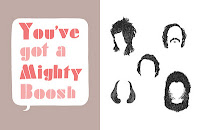
3) Book Design, The Mighty Book of Boosh,


 The Mighty Book of Boosh is a really nice piece of design in my opinion, the book is a bit chaotic but it fits the program perfectly and has some really interesting  designs and sketches in there, i especially like the page with the hair it's an awesome illustration.

4) Tube Train Advertisement, Canon Printers advertisement by Daehong Communications


Clever advertising, this being smaller scale works well and I also think if this was done on a larger builboard scale it would also work. clever, simple, unique and affective.

5) Indoor wall vinyls.


I particularly like the second image with the birds, it has a real comic book feel and would be quite interesting to have this in your house, a different way of decorating and making a piece of design out of your front room wall.