5 Examples of Graphic Design appearing in different contexts.
1) Invitation, The first piece of design I have chosen is a piece by Experimental Jetset,
This is Experimental Jetset's invitation design for "Wim Crouwel; Architectures Typographiques" exhibition, I like how this is a large piece of 3D design built in their studio all of which is based on perspective. they have used an existing Wim Crouwel typeface which I think is awesome, to go on large hanging sheets. I really like the finished photographed image on the front of the invitation, even to the point he is stood under the "W" to represent "Wim".
2) Book, An 80 page book by Luke Hayman of Pentagram for "Matisse as Printmaker" exhibition at the Baltimore Museum of Art.
I mainly chose this book as I really like the design of the front cover, The simplicity and space of it is really quite aesthetically pleasing, the bright yellow has been chosen to compliment the work of Matisse which I believe it does.
3) Food Packaging, the Identity and packaging designed for ChinaMax restaurant designed by Pentagram.
I like the Comic style of this design, the simplicity of the colours with the comic book back ground really looks smart. it all comes together to create quite a unique identity for this restaurant.
4) Identity, Superfried design the Identity and packaging for Huttons
I like Superfried I think they design some really interesting and unique work. i like the identity and branding of this shop, the typography is really nice and it's quite and interesting logo, simple but smart, especially the design of the bag.
5) Advertising, This is a very creative advertisement by Serviceplan, Munich, Germany
This is a really clever piece of advertising, I love the use of reflection to complete the design, obviously this piece of design would only work in specificly planned out areas, but i think its creative having the type as a reflection.
5 examples of graphic design performing different functions.
1) Tempting, New Diet Coke Can and packaging design by Turner Duckworth
This designs function is to attract people. I like the new Matte effect that Coke have started using in the past few months, Turner Duckworth have designed alot of their new promotional designs. this new Diet Coke design uses the fact that Coke have one (if not THE) most well known logos in the world, so They only have to take a small part of that logo and people can still tell its coke. I think this works really well in this design and i think enlarged logos on smaller objects look brilliant if done correctly.
2) Advertising, Specsavers Advertisement by Smart , Australia
The Function of this design is to Sell/ Advertise, This design just made me smile, I like a lot of the Specsavers adverts as many of them have good comedic value which I think is a good way of selling a product or company.
3) Informing, Road Signage
The function of these designs are to warn drivers and pedestrians on the road of the oncoming obstacles, Road signs are very well thought out and designed for the main reason of informing and warning road users, they use simple visual communication to allow anybody to understand the dangers ahead.
4) Warning, Think "Tiredness Kills Poster"
I wouldn't say that the aim of these posters were to scare but they do have some aspects of the "fear factor" to them, this poster in particular I really liked, with its dark composition and clever message it does everything it needs to do inform/ scare people into driving safely on the roads.
5) Entertaing, Walk the line movie poster
The function of this piece of design is to Entertain, I find this design visually pleasing in a cool Johnny Cash way, the poster itself is entertaining to me but also it's used to advertise the movie, but I think a lot of movie poster designs have the idea in mind that people will buy these after or before the film is out for their private room decoration similar to hanging a piece of art, this is all done because the person finds the image visually appealing.
5 examples of graphic design delivering different messages.
1) Obama's campaign Poster by Shepard Fairy
This is the most obvious piece of design when you talk about political messages, This design was found everywhere and has become Obama's Identity in a way.
2) El Lissitzky's Design 'Beat the Whites with the Red Wedge'
A design to symbolise the seize of The Winter Palace by rebels in the Russian civil war, the red, strong, uniformed triangle symbolising the rebels, penetrating the unprepared soft white crcle representing the white army.
3) NSPCC 1984 Fundraiser Poster
4) RSPCA animal neglect campaign poster
5) Think driving on a phone advertisement.
Campaign to bring awareness to the dangers of driving while on a mobile phone, bringing the design to a more realistic area with it being on a road sign. it is more informative than shocking but still gets the message across
5 examples of graphic design produced using different media.
1) Glass Jar, Fuego Hot Sauce by Stephanie Hughs
2) Website, Couch Creative Website
I like the simplicity yet complexity of this website, it is quite a unique and interesting one, and if you follow the link above its quite nice just testing out all the links to see another new part of design add itself to the website. some of the links arn't too exciting but I think it is a nice spacious layout and visually better than most websites.
3) Television Advert, VW Polo Advert
I really like alot of the VW adverts I think its extremely entertaining advertising, even though a fair few of them have been banned from television due to so called offensive material, I am a little confused of where graphic design stops and television media starts but I thought it was worth posting this from a graphic designers perspective.
4) Letter press/ Print, Business card by Justinas
I found this on a website that showed a variety of interesting and unique letter press business cards, this one stood out to me as it has a strange feel to it, at first glance you think it could be metal but then after studying it looks liek it has stone like qualities. Really smart type and a neat layout, a very professional design in my opinion.
5) T-shirt Design, 'Foam Monster' by Alex Lewis
I love unique illustrative t-shirt designs, I like the uniqueness and comedic value that they present, this one is really nicely illustrated and by using minimal colour on a busy image it really works well on a t shirt.
5 examples of graphic design produced at different scales.
1) `Graphic Installation, Lays Potato Installation
This idea is fantastic, taking the urban location and and turning it rural for a few meters, with the obvious effect of the potato installation on the ceiling also the billboard helps the rural feel with a barn like finish.
2) Business card, design by Alteroy Design.
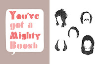
3) Book Design, The Mighty Book of Boosh,
The Mighty Book of Boosh is a really nice piece of design in my opinion, the book is a bit chaotic but it fits the program perfectly and has some really interesting designs and sketches in there, i especially like the page with the hair it's an awesome illustration.
4) Tube Train Advertisement, Canon Printers advertisement by Daehong Communications
Clever advertising, this being smaller scale works well and I also think if this was done on a larger builboard scale it would also work. clever, simple, unique and affective.
5) Indoor wall vinyls.
I particularly like the second image with the birds, it has a real comic book feel and would be quite interesting to have this in your house, a different way of decorating and making a piece of design out of your front room wall.


