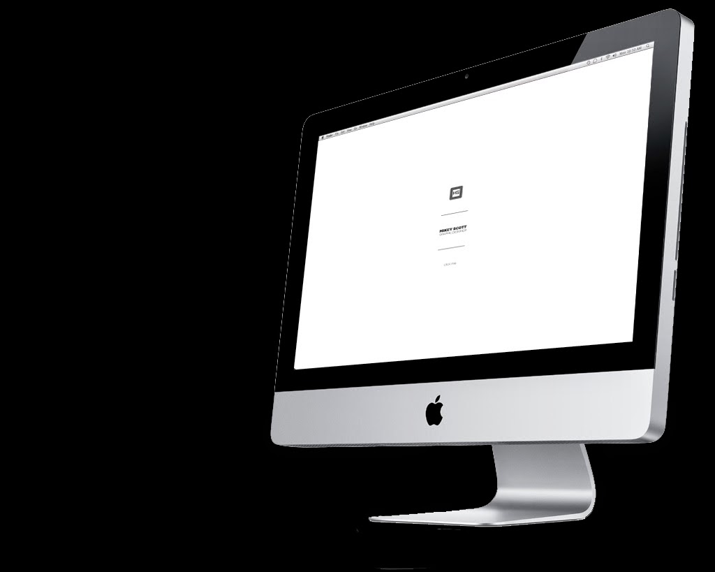
Below are my current links to my online presence, I have not as of yet got a live website, however I have purchased the domain name, and I am in the process of constructing and coding my website. but this will probably continue once the course has finished.
Behance - https://www.behance.net/mikeyscottjr
Website - mikeyscottjrdesign.com
Linkedin
Twitter - @Mikeyscottjr
Sunday, 18 May 2014
Thursday, 1 May 2014
Personal Branding // Website visuals and mock ups
As you click through the menu options you will find the choices
- Home
- About
- Work
- Contact
I do not want to over complicate this website, I want to use it purely as a promotional digital cv, and I don't want the complexity of the web design to take away from presenting my work.
The website will be based around my visual branding that you saw earlier applied to my business cards, but in this context the logo doubles up as a platform for the menu bar to located.
The home page is simply my logo with a 'click me' button at the button, from them the logo and menu bar re locate from the centre to the top left hand corner and full screen images of selected portfolio product shots will randomly fill the screen as a background.
Starting page
Home
The background of the page will keep on scrolling through full screen images of my work but depending on the page that you have selected a different paragraph of information will be provided at the bottom left of the page as you can see below, this way, the viewer still continues to whitness my work but also can read the information they require.
The same concept applies to the about page, but with further information provided about me as a designer and my specialist areas and bio.
The work page gives the viewer an option to select which specific works they would like to view, and once selected an archive of each project will be presented and they would then be allowed to scroll through and select images at will.
Contact information is a very simple page, with just my current information being promoted, I find with many designers websites, it is actually quite difficult to find contact information because it is often over shadowed by the physical design of the website. My intentions are to keep it as simple, understandable and aesthetically pleasing as possible.
Below you can see how each page is intended to be viewed on a computer screen, I need to update the layout to allow it to be applied to smart phones and tablets.
Start
About
Contact
Home
Work
Friday, 25 April 2014
Personal branding // Updated business card mock up
At this moment I intend to send my business cards off to get printed professionally as I do not have time to hand print my stationary like I would wish. However at this current stage I just wanted to create a visual that would give some understanding of what they would be presented like, therefore I have mocked up the image below.
Personal Branding // Updated Business Card
For my personal brandng, I was actually quite happy with the visual side of my actual logo, but I think they way I have applied it to some of my stationary diesign does not could be updated to fit a style that I think suits me as a designer.
Below is the business card design I produced in level 5.
Through using this branding on various presentation bards for live and competition briefs this year, I have played around with the layout of the branding and think something like the design I have used on my manifesto presentation gives my visual identity a little bit more of a neater and professional outcome.
Therefore I have tried to apply this simplistic version of my branding to various other pieces of stationary I intend to include in my brand pack.
Below you can see my new business card option which I am much happier with.
The new design creates quite a modernist feel, but I want the visual element of my identity do remain both simple and consistent throughout my entire brand and I believe that this layout would allow the main core to remain the same throughout while using the thin text at the bottom to update information depending on what format the logo is applied to.
Front Variation 1
Front Variation 2 (chosen)
Back
Saturday, 8 March 2014
PPP3 // Sagmeister Ted Talk
I have always considered Stefan Sagmeister to be one of my favourite designers, not just because of his unique and original design style, but also because of his positive outlook on life and design, He strives to enjoy all the aspects of his life, and uses his own happiness as a tool for his design. I often get worried that I will end up in an area of design that I will not enjoy, but i try to take inspiration from Sagmeister's positive outlook.
He also is one designer that I think promotes the message of being individual with your design, in a sense that I personally feel that alot of design follows trends, once someone comes up with something original and people like it, then often other designers will adopt that style of design for as long as that trend lasts, however Sagmeister's work is always original and he consistently finds new and interesting ways to produce a piece of design. This all comes from using his own ideas and using experiences and memories as a tool to produce original and interesting design.
Here is a Ted talk I found where Sagmeister explains his view on happiness in relation to design.
Saturday, 15 February 2014
PPP3 // Mikey Says Manifesto
My Manifesto presentation trying to create a list of points I personally think can help you in life, I'm sure these points will be refined and changed over the years but at the moment I am content with this manifesto, especially point 7!
Thursday, 30 May 2013
PPP2 // Module Evaluation
1. What skills have you developed through this module and how effectively do you think you have applied them?
Throughout the whole of this year, PPP2 has kind of always been hidden away in the background, but we have learnt a lot to support the fundamentals of our practice, and even thought I am still a little clueless, I have more of an idea how studios / collaborations are formed.
I have grown a little more in confidence with the work I am producing, especially towards the end of this year, and this module has helped me understand how I would go a bout approaching studios, John has re inforced the fact that networking is the most important element of a graphic designers life. Even though I hav't started contacting studios as of yet, I still have more confidence of both the types of studios I would like to work in as well as how I would get my foot in the door (so to speak).
Working as part of a group in Life's a pitch wasn't as fun as I initially thought it would be, I realize that it was finding all the duller important information that would help build the foundations of a business, but our group struggled to ever get any time where we were all together, so therefore the collaborative element was lost a little bit. However i learnt about necessary costings that you can apply to your practice whether you are freelance or part of a studio. everything costs money so charge them for it.
'DON'T BE AFRAID TO ASK FOR MONEY' - John
2. What approaches to/ methods of design production have developed and how have they informed your design development process?
3. What strengths can you identify in your work and how have/ will you capitalise on these?
Again, anything I have learnt this year that has developed my design work or skills was learnt in the other modules, I couldn't confidently point out a strength in my self branding as I think I am going to change it as I don't really like it any more.
4. What weaknesses can you identify in your work and how will you address these in the future?
The main weakness I found for my branding was the fact that I faild to analyze myself and my interests enough to know actually how I would brand myself. it is a really difficult question to answer when someone says 'describe yourself visually' where are you meant to start? and I often find that I what I think are my strengths are often not and factors I just take for granted are actually my main strengths. I need to conceptualise my self branding more, I want to come up with a concept that not only visually represents me and my practice, but also is a really clever idea that would help grab the attention of who ever I eventually send this to.
5. Identify five things that you will do differently next time and what do you expect to gain from doing these?
- Ensure that I develop a solid concept for my self branding rather than just trying to design a logo that I like for myself, which is what I did this year. This will help bring all my product range together as well as hopefully represent myself more appropriately.
- Contact studios, go to design events, start emailing designer I like, getting more of my work out onto the world wide web, as at the minute I have no networking progress, and I would ideally like to have a few visits and placements under my belt before I complete third year, I think at the minute even though my confidence in my work is growing, I am still not overly confident with what I have produced, enough to send it as my samples of work.
- Contact studios, go to design events, start emailing designer I like, getting more of my work out onto the world wide web, as at the minute I have no networking progress. An online presence is very important for all creative industries and it is something I want to develop so I am ready to represent myself when I am no longer at LCA.
- Organise myself and my time better, this will avoid the rushing and panicking stages towards the wend of the module, which is probably why I have ended up with some self branding that I don't actually like.
- Spend more time researching studios or freelance designers that really appeal to me and my taste in design instead of just looking at more main stream studios that everybody looks at, I really want to have a large list of studios and designers I like. I forget that looking at others work can really inspire you and make design a really fun thing to do. I think I forget that I enjoy design sometimes and this is mostly down to stress on the course and a large work load that I am still trying to manage myself around
6. how would you grade yourself on the following areas?
Attendance -3
Punctuality - 4
Motivation -3
Commitment -3
Quantity of work produced - 3
Quality of work produced -3
Contribution to the group - 4
Subscribe to:
Comments (Atom)


